
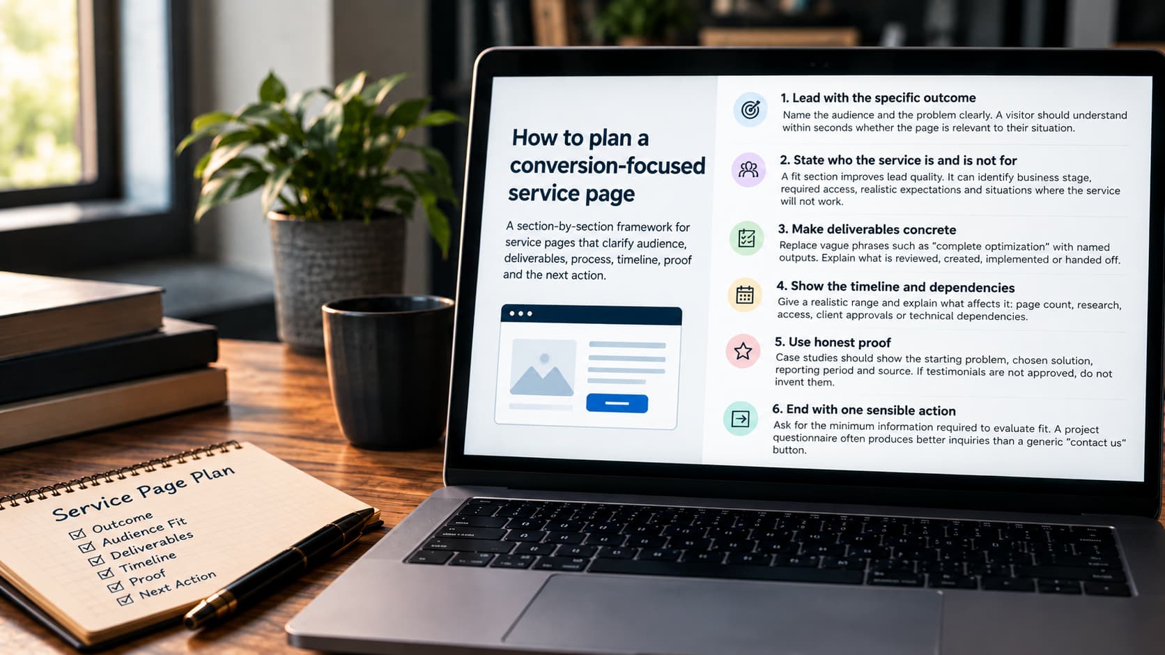
Most service pages fail at one job: helping the right buyer decide whether to continue. A service page is not a brochure full of broad benefits — it's a decision aid. Every section exists to reduce a specific kind of uncertainty: fit, scope, process, evidence, or what happens next. A page that reads well but leaves any of those five vague is still an unfinished page.
Lead with the specific outcome
Name the audience and the problem clearly. A visitor should understand within seconds whether the page is relevant to their situation.
State who the service is and is not for
A fit section improves lead quality. It can identify business stage, required access, realistic expectations and situations where the service will not work.
Make deliverables concrete
Replace vague phrases such as “complete optimization” with named outputs. Explain what is reviewed, created, implemented or handed off. Instead of "complete optimization," something like "12 on-page SEO fixes, 3 new internal links and one schema addition" tells a prospective client exactly what they're paying for — and gives the team something specific to deliver against.
Show the timeline and dependencies
Give a realistic range and explain what affects it: page count, research, access, client approvals or technical dependencies.
Support claims with real material
Case studies should show the starting problem, chosen solution, reporting period and source. If testimonials are not approved, do not invent them.
End with one sensible action
Ask for the minimum information required to evaluate fit. A project questionnaire often produces better inquiries than a generic “contact us” button.
Review the page as a skeptical visitor, not its author
Before publishing, read the page as someone comparing three competitors in the same tab group. Does it answer "why this provider" without relying on adjectives like "best" or "leading"? Does every claim have something concrete behind it — a number, a process step, a named deliverable? A page that still reads convincingly after this pass is closer to ready than one more round of internal polishing would make it.
Handle the objection before it's raised
By the time a visitor reaches a service page, they usually already have a reservation — too expensive, too slow, not sure it applies to a business their size, burned by a previous provider. A page that never names these doesn't make them disappear; it just means the visitor leaves to go find the answer somewhere else, often on a competitor's page. Naming the one or two most common objections directly, in plain language, keeps that visitor on the page instead of sending them searching.
Design for the skim, not just the read
Most visitors scan headings and bolded phrases before committing to read a full paragraph. If the headings alone — read in sequence, ignoring the body text — don't tell a coherent story about what's offered, who it's for, and what happens next, the page is relying on visitors who read every word. Most won't. Write headings as statements, not labels: "What's included" tells a skimmer less than "12 fixes, 3 internal links, one schema addition."
Mobile-specific checks, not just a responsive layout
Responsive doesn't automatically mean usable. On a phone screen, check specifically: is the primary call to action visible without scrolling past three screens of text, does a comparison table collapse into something readable instead of shrinking illegibly, and does tapping the contact button open a form that's actually fillable on a small keyboard. A page that tests well on desktop and gets most of its traffic on mobile is being graded on the wrong device.
Revisit the page on a schedule, not just when something breaks
A service page goes stale even when nothing is technically wrong with it: pricing drifts from what's actually being quoted, a case study becomes the oldest thing on the page instead of the most recent, a competitor's new page changes what "enough detail" looks like in that category. Reviewing priority service pages every quarter — not waiting for a drop in inquiries to notice — catches that drift while it's still a small edit instead of a rewrite.
This framework pairs with content strategy work when the page sits inside a larger site rebuild, or landing page design when it's a single focused page built for one campaign.